In the visualization below, which line do you think represents the UN’s forecast for the number of children in the world in the year 2100?
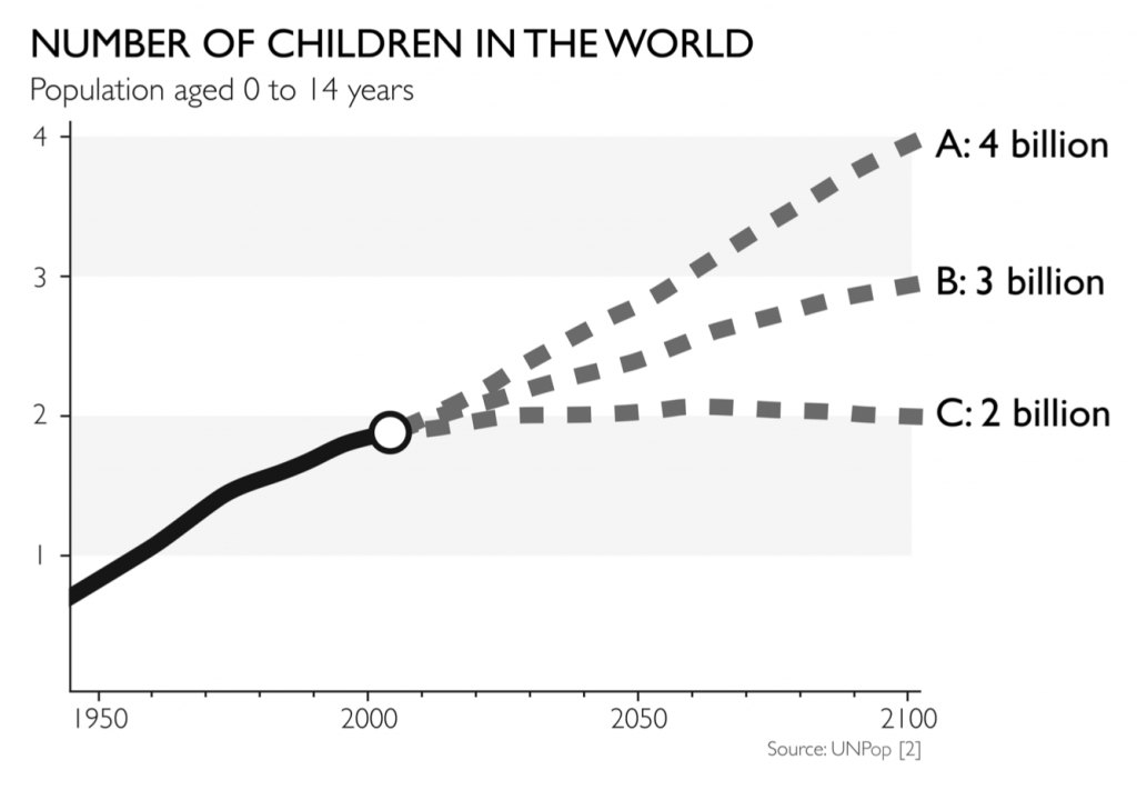
Hans Rosling, in his book Factfulness, presents this chart and notes that in a sample of Norwegian teachers, only 9% correctly identified the correct answer. Rosling, who died two years ago next month, notes that better results would be obtained by guessing randomly – chimpanzees guess the correct answer 33% of the time. The correct answer is C, and two factors are at work in leading people astray.
-
An extrapolation of previous trends would lead one to guess A or B.
-
More important, what people have read and seen in the news over many years has conditioned them to think in terms of the population problem, i.e. rapid population growth in poor countries that will strain the world’s resources and degrade the environment.
In 1968, when Paul Ehrlich published his book The Population Bomb, an unsustainable worldwide population explosion was the consensus view – fertility rates in China and India were about 6. The big story since then has been the drop in birth rates, India and China now hover just at and below replacement rates (which is about 2.3 worldwide).
So the big story here is population stability, no longer population bomb.[1] And, more broadly, all along the story has been that the world’s condition has been improving. Julian Simon (who was a pioneer in resampling methods in statistics) is often regarded as the original apostle of this optimist school. His book The Ultimate Resource set out the thesis that pessimistic or alarmist views are often based on small samples of data (typically time series) that come to our attention because they suggest something alarming. Simon, who also died in February (21 years ago) took various alarms that had been raised (running out of oil, using up farmland) and showed how, when viewed in the context of longer-term trends, the alarm in question was a blip. Just as important, he viewed these alarms in terms of their real meaning to people. The relevant measure of oil scarcity, for example, is not how much oil we think lies beneath the ground, but rather how difficult it is for ordinary people to obtain fuel – in other words, its price and availability.
But, compared to bomb or explosion, the stability story does not sell newspapers or generate re-tweets. The population stabilization story, and the dramatic decline in the fertility rate that lies behind it, is, in fact, a huge story for the planet, but it is a positive one[1], and positive stories are a harder news sell. The human attraction to bad news is related to what psychologists call loss aversion. Daniel Kahneman (in Thinking Fast and Slow) describes how the human tendency to give priority to bad news over good news is rooted deep in human evolutionary history. The ability to quickly recognize and deal with threats and predators contributed to survival in early humans; focusing on good news did not. Images depicting faces of alarm or terror were shown to subjects for 2/100th of a second – too short a period to register cognitively. Nonetheless, the brain’s amygdala, a super-fast neural channel that feeds directly into emotions, showed an intense response to the images, which the subject did not later remember or recognize. Images of happiness do not get this express pathway to the emotions – they must be filtered by the brain’s cognitive processes.
Ironically, images and visualization have played a key role recently in propelling the “optimistic†perspective that Simon pioneered with The Ultimate Resource. Hans Rosling became famous for his web-based dynamic visualizations that dramatically show the improvement of the world on a variety of metrics over time. These interactive visualizations of country conditions can depict five variables at once using the two axes of a scatterplot, the size of markers (population), the color of markers (region) and the movement of markers as you watch (time). Check them out at www.gapminder.org, and learn more about these techniques using Tableau in our course Interactive Data Visualization.
[1] Actually the story may ultimately be population decline, rather than population stability. In prosperous areas like Japan, North America and Europe the fertility rate is already below the replacement rate. The precipitous fertility declines of China and India, along with those countries’ march to prosperity, portend a world population that will ultimately start declining. For now, we can rest comfortably in the world economy’s ability to bring under-employed people into higher levels of capability and productivity. That, plus the ability for robots and machine learning to take over some of the more routine tasks, will at least assure our future well beyond the lifetime of the readers of this article.