A recent development in the modeling of Covid-19 data has been the use of mobile phone location data, now available from Google, to estimate the degree to which social distancing restrictions have been implemented, and the effect they have had.
One interesting analysis comes from Mike Thurber and John Elder here at Elder Research, Inc. They looked at reductions in mobility by country and by venue (transit, parks, grocery & pharmacy, work, and retail & recreation), due to restrictions. They also looked at “R,” the effective reproduction rate of the virus in each country. Was there a relationship? Did countries with more restricted mobility have slower virus spread (lower R)? They aligned countries by the stage they were in (relative to their eventual peak infection day), then fit a regression line to the cross-country data and recorded the slope for every day.
Until about 2 weeks prior to peak virus spread, the mobility restrictions had the expected relationship with R: the slope was positive, indicating that restricted mobility did indeed go with lower R. Figure 1 illustrates this for 15 days prior to peak infection:
Figure 1: Relationship between R and mobility to Retail & Recreational venues 15 days prior to peak (slope is 0.71)
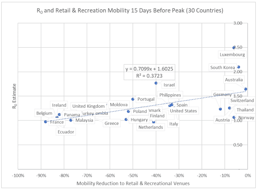
However, as countries approached the peak of their outbreaks and the spread slowed, the relationship between mobility and R disappeared; whether a country had more or fewer mobility restrictions at that stage did not make a difference in R(i.e. the regression slope was close to 0).
Thurber and Elder calculated this regression slope for each day in a country’s outbreak, and plotted the resulting lines for each venue:
Figure 2: Slope of regression line between R0 and Mobility, by day
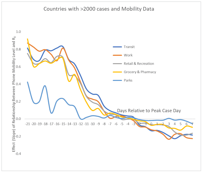
Note how the slope remains high, up until about 2 weeks prior to the peak of the spread (day 0), indicating that countries with greater mobility restrictions have slower virus spread. As countries approach the peak, this relationship diminishes, disappears (slope drops to zero), then reverses. After day 0 greater mobility restrictions, to a small degree, are associated with faster, not slower, virus spread. This counterintuitive result is intriguing and merits further investigation. (One hypothesis is that the success of early mitigation in locked-down countries “flattens the curve” which defers some of their cases to after the peak, worsening their statistics then.) And the Parks venue stands out; keeping people away from parks helps very little in slowing the virus.
The MIT Analysis
Another analysis comes from Agarwal and a team of data scientists at MIT. This analysis attempts a more direct answer to the $64,000 question:
“How effective are lockdowns?”
Actually, this should be the $10 trillion dollar (or more) question, considering the economic cost of the economic collapse Covid-19 has caused. The MIT team divides this question into two parts:
- How effective was a given country’s actual lockdown, compared to other scenarios they might have pursued? and
- In the future, what effect would different lockdown options have in a given country?
There is a menu of lockdown and other mitigation measures a country or region can take to suppress the spread of Covid-19 – requiring masks, forcing social distancing, contract tracing, school closures, and implementing targeted or full work, retail, entertainment and recreational shutdowns. As the world rides out the current wave of infections and prepares for a likely resurgence in the fall, policymakers will want to know what measures are most effective, and whether something short of complete shutdown is effective.
Simplifying the Problem
To speed their analysis to pre-press publication, the MIT team simplified the problem by ignoring the qualitative nature of restrictions and focusing simply on their collective magnitude of effect on mobility, based on cell phone data. They divided countries’ experiences into three categories, based on measured mobility reductions from a January 2020 national baseline:
(a) Low Restriction < 10%
(b) Moderate Restriction 10% – 40%
(c) Severe Mobility Restricting Intervention > 40%
The team then collected time series data on deaths for each country for two periods:
- Pre-intervention (defined as prior to the cumulation of 80 deaths)
- Post-intervention (after 80 deaths)
Their general approach was to align a “target country” (i.e. country for which you want to make a prediction) with a group of 3-5 similar countries each with a similar pre-intervention track record, but which ultimately implemented different intervention strategies. Countries were separated into three groups, having restriction regimes that were:
Group 1 – low
Group 2 – moderate
Group 3 – severe
The team then used the actual group 1, group 2 and group 3 average post-implementation trajectories as a prediction for what would happen to the target country if it were to adopt a low, moderate or severe restriction regime. For example, here is a plot of the different predicted trajectories for Turkey, classified as a moderate restriction regime:
Figure 3:
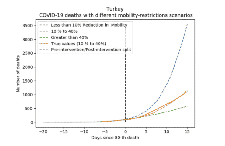
You can see that the actual outcome – the solid line – matches up well against the prediction.
Their conclusion
Moving from minimal to moderate restrictions helped slow the virus a lot (from the dashed blue line to the dashed and solid orange lines). Moving from moderate to severe (from the orange lines to the dashed green line) had lesser impact.
Comment
The worldwide Covid-19 crisis has pushed a lot of early-stage, non-peer-reviewed research out into public view, by means of blogs and pre-print services like arXiv. Readers get to play the role of research colleagues, at least in the imagination, both posing questions and sharing authors’ hints on where they might go with a more complete project.
The Agarwal team mentioned a couple of directions for extending their research:
- Incorporate clustering behavior into the model
- Add covariates into the analysis (the actual analysis was based purely on mobility data and death statistics)
Also, I would expect that a peer-reviewed version of this article would include more detail on how the comparison countries (called the “donor countries”) were selected – was it simply the most similar handful of countries? It is also worth noting the rapidly changing landscape that researchers in this area face. Agarwal and his team put their work out for public view via the arXiv prepress service as quickly as they could, but still the data was a month out of date when their article was published.
Relationship to Other Models
The modeling approaches used by both the Elder Research and Agarwal teams are not the traditional epidemiological state-change SIR simulation models, in which specified parameters govern how individuals move from Susceptible to Infected to Removed. The Agarwal team’s approach shares some similarity to the IHME University of Washington model, in which forecasts for a target country are based on fitting its Covid-19 curve to the aggregated Covid-19 curve of several early base cases. Agarwal et al extend this by selecting multiple base cases that (a) more closely resemble the target, and (b) reflect three different restriction scenarios that allow what-if analysis. Looking to the future, the next step in modeling may be to return to a global analysis and incorporate covariates that reflect both the type and extent of restrictions enacted, as well as salient country demographic and cultural characteristics (e.g. typical household sizes, and, if there is a way to measure it, gregariousness). This would allow a more nuanced, textured and informed public health response to the ongoing pandemic.